Zwilling
2020

2020
Mobile App
Main activities
UI Design
Typography, Layout, Colors
UX Design
User research, etc...
Motion Design
UI Animation
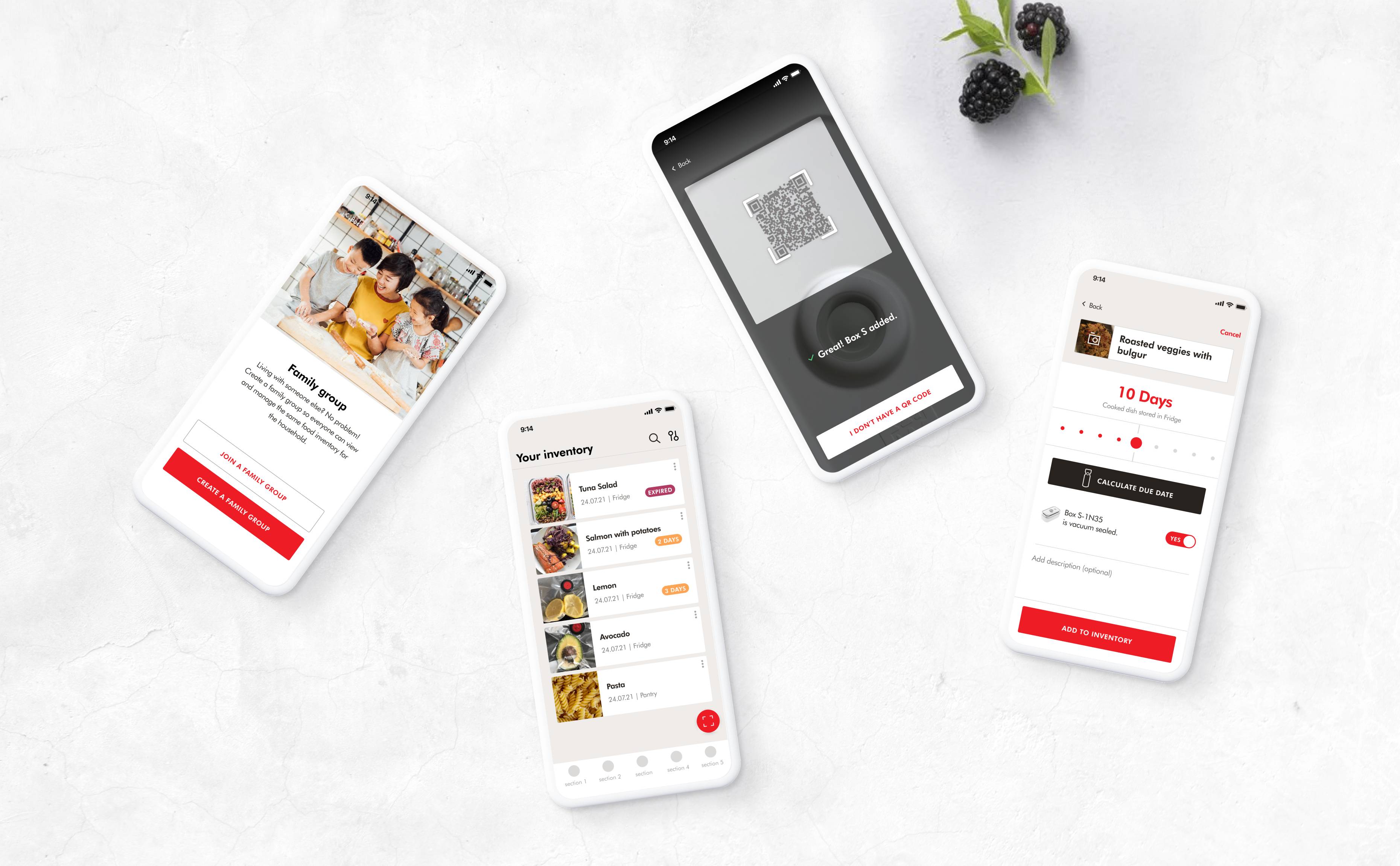
Zwilling, a renowned German brand known for its high-quality kitchen knives and extensive range of utensils and appliances, is now embracing design to expand its product offering into the digital space. They tasked us with enhancing the app's usability, redesigning it from the ground up to envision the future of cooking. We created a personalized experience, allowing users to manage their food with a digital fridge and receive recipe recommendations based on their inventory and devices—a true "kitchen companion."


DLS
01
Starting from the storied Zwilling brand identity. I was responsible to create a new DLS for the mobile touchpoint. Foundational elements like colours and typography, UI components, icons and illustrations have been created to maintain consistency among screens.

02
During a stakeholder interview, it became clear that the new app needed to move away from Zwilling’s conservative image by introducing a more playful approach. This insight guided me in developing a new visual language that balanced Zwilling’s tradition with a fresh, approachable tone.
Illustrations, with their ability to evoke emotion and convey abstract concepts, offered a dynamic alternative to photography, while delicate grainy shadows added a human touch. This visual language allowed for playful interactions and animations, injecting energy and fun into the user experience.


03
We developed a gamification system with points, missions, and rewards to help users feel a sense of progress toward a larger goal, ultimately enhancing their sense of accomplishment. From our user interviews, we identified three core user goals: improving cooking skills, keeping the kitchen tidy, and reducing food waste to care for the planet. I translated these goals into illustrated characters that grow based on experience points earned through app usage and mission completion.


Thank you for watching!

